

How to Vectorize Serif Lettering With the Pen Tool

The pen tool is maybe the most important tool in all of Adobe Illustrator - it's the workhorse of the program, and your Illustrator abilities are pretty limited without it. It has quite a learning curve, but with practice, it opens up a whole new world of lettering possibilities. The pen tool can be used to transform your rough sketches into polished, vector (infinitely scalable!) lettering.
At first glance, attempting to turn the sketch on the left into the polished type on the right seems pretty daunting, doesn't it? I promise, you can do it! Let's break it down into manageable steps.
Scan or Take a Picture of Your Sketch
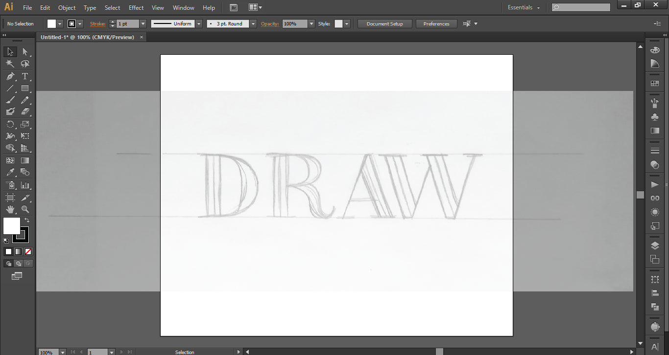
The first step is to take a rough sketch and take a picture or scan it. Since the resolution of the sketch doesn't matter, taking a picture in this case is all you need. Create a new document Illustrator, and use File > Place... to browse for your image and place it in the document. Resize as necessary to center it in your artboard. I like to lower the opacity of my image to about 50%, just to avoid any visual confusion with my pen lines. Then select the image, and click Object > Lock > Selection. This locks the image in place so you won't accidentally select it and move it.
Before we've even started vectorizing, you can probably see how imperfect your sketch is - I already know I want to move the D in a bit, as it's a little too far out on its own, and I know my W is going to need to be narrower. When I know I'm going to be working with vectors in the end, I don't worry about making my sketch too perfect. It's far easier to correct mistakes on the computer than with further drawing!
Pen Tool Basics
Before we start vectorizing our type, we need to go over a few basics of the pen tool. With the pen tool selected, click on artboard to create paths with straight segments. Create a point and hit Shift as you click to create your next point, to align the two points exactly to create a straight line. If you do this for all 4 points of a rectangle, all of your points will line up perfectly (this is especially useful for thick crossbars and straight down strokes).
Click and drag to create paths with Bezier curves (the handlebars that stick out on either side of a point). If you hold shift while you click and drag, your handles will maintain a 0, 45 or 90 degree angle. Always drag your mouse in the direction of the next point you'll create.
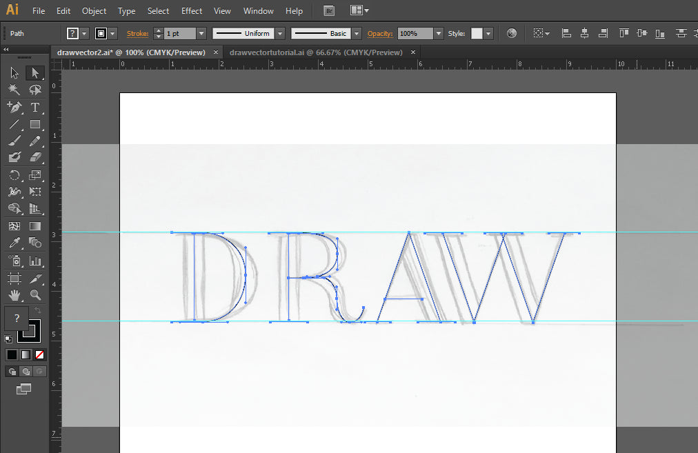
Draw Your Skeleton
Just like when I'm sketching, I find it easier to build my vector piece with layers rather than trying to get it all in one shape. So we start again with the skeleton!
Select the pen tool, and make sure it's set to a 1 pt. stroke with no fill. Create a line down the center of the stem of your D by clicking to create an anchor point at the top, and hitting shift as you click to create a second anchor point at the bottom. This will create a perfectly straight line.
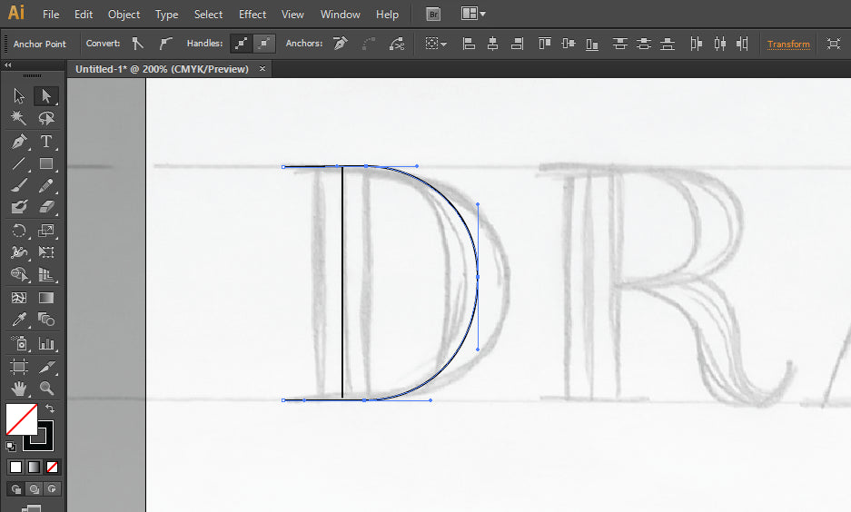
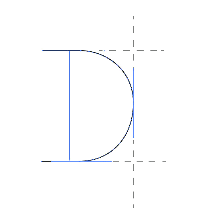
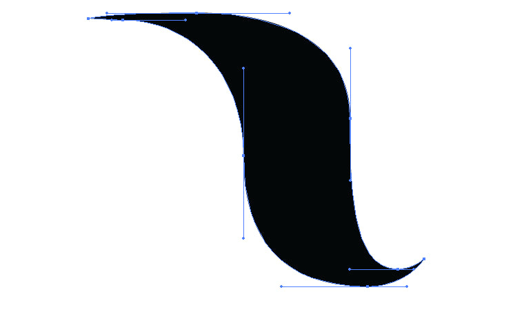
The bowl of the D is a bit trickier - it's made up of 5 anchor points.
Anchor point 1: Click to create a point at the terminal (the very end) of the top serif of the D. Don't drag your mouse here - no need for this to be a curved point.
Anchor point 2: Holding shift so your line is straight, click to create a point at the beginning of the bowl of the D. Continue to hold shift, and drag your mouse to the right to create a curved point with horizontal handlebars.
Anchor point 3: Click again toward the middle of the bowl of the D, hold shift (after you click!), and drag your mouse downward to create an anchor point with vertical handlebars.
Anchor point 4: Create a point at the end of the curve of the D, lining it up as closely as possible to the same point at the top of the D. Hold shift, and drag your mouse to the left to create a curve with horizontal handlebars.
Anchor point 5: Click to create an anchor point at the end of the bottom serif of the D to complete the line.
Then, using the Direct Selecttool (the white arrow), go back and adjust any handlebars as needed to create a smooth curve. Let's pause for a moment to talk about proper handlebar protocol. Take a look at the handlebars above - they demonstrate a few key rules for creating handlebars that are easy to tweak and evenly share the work of creating the perfect curve.
Don't cross the streams. (this is possibly my favorite tip I've ever learned from following Jessica Hische - this concept didn't really stick with me until I heard her phrase it that way). If you draw imaginary lines continuing each handle bar to infinity, none of them should be long enough that they cross into the other's paths. They cross into each other's paths when you give one way too much work to do creating the curve. Following this rule will ensure you're distributing the workload of creating the curve evenly onto each anchor point.
Stick with horizontal and vertical handlebars. If you're just starting out, it's great that you're learning this now. You don't have any bad habits to break! Committing to horizontal and vertical beziers simplifies where you place your anchor points - your options are limited, because now, to get your curve along the outermost edge, you have to place your points at the outermost points of the curve! It makes narrowing down where your points are going much, much easier, and it also reduces the total number of anchor points you'll have, which makes tweaking the piece easier. I became much less overwhelmed with plotting anchor points once I committed to only using horizontal and vertical handlebars.
Using these same techniques, draw out the rest of your skeleton. The bowl of the R is similar to the bowl of the D - the trickiest part of this letter is the leg, because it's so curvy. You'll create this with four anchor points: a horizontal handlebar at the top of the curve, a vertical handlebar in the middle, a horizontal one at the bottom, and a plain old corner anchor point at the very tip of the leg. A and W are very straightforward (pun intended) - just an anchor point at the end of each line, and short straight lines to create all of your serifs.
Create your Body
To create the thicker downstrokes of our letters, we're going to use the pen tool to create filled shapes rather than strokes. I like to set my opacity down to 80% or so, so I can still see the skeleton underneath as I tweak the body.
Creating the straight downstrokes is the easiest part. Using the pen tool, click to create the first corner point of the rectangle. Then, holding shift, click to create the other 3 corner points, and then click your initial anchor point. This will create a perfectly straight rectangle (and bonus, you can copy and paste this to quickly add the downstroke for the stem of your R)!
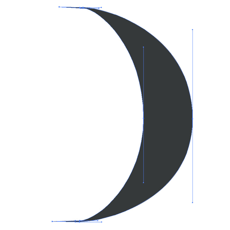
To create the thicker downstroke for the bowl of your D, you're going to need to create a sort of crescent moon shape. This is comprised of 8 total anchor points:
Anchor point 1: Start by making an anchor point along the stroke of your skeleton.
Anchor point 2: Create a curved anchor point just a little bit away from it, holding shift and dragging your mouse a bit to the right.
Anchor point 3: You want your skeleton stroke to be along the center of your final downstroke, so create an anchor point a bit outside of that stroke to create the outermost part of your bowl. Holding shift, drag your mouse down to create the vertical handlebars.
Anchor point 4: Create a horizontal handlebar curve at the bottom of the curve of the bowl.
Anchor point 5: Make a corner anchor point inside the stroke of the skeleton.
Anchor point 6: Make a curved anchor point just a little bit away from the corner point, holding shift and dragging your mouse a bit to the right to create the beginning of the inside of the bowl stroke.
Anchor point 7: Create an anchor point inside your skeleton stroke, to create the innermost curve of your bowl. Holding shift, drag your mouse up to create the vertical handlebars.
Anchor point 8: Create a curved anchor point at the top of the inner curve of the bowl, dragging your mouse a big to the left to create the horizontal handlebars.
Now, we're right back where we started - to complete the shape, click your first anchor point again.
Following the same pattern, create the inside edge of the downstroke. Here's what your final points should look like:
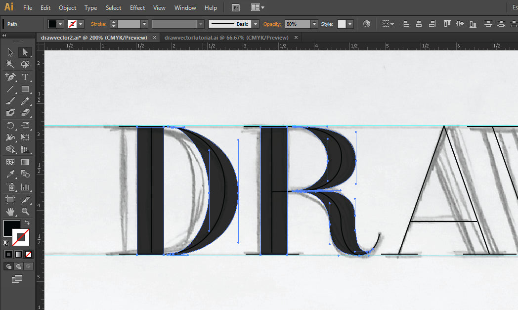
Just like the skeleton, the bowl of the R is constructed identically to the bowl of the D - just shorter. The leg of the R will follow the same anchor placement of the skeleton, and your final shape should look like this, with 8 total anchor points:
To create the diagonal strokes of the A and W, I like to copy and paste the straight downstroke from earlier. Using the Direct Select tool, you can select just to top 2 points of the stroke and nudge them to the left to create the angle you need. For the A, you'll need to use the Add Anchor Point tool (in your toolbar, click and hold the pen tool, and select the pen tool with the + sign from the dropdown that pops up) to add an additional anchor point, so you can create the triangle edge at the top.
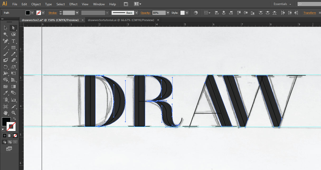
When you have all of your downstrokes created, this is what your lettering should look like:
From here, it's easy to make further edits. I knew my W was a little too wide, so I moved my shapes around a bit to make the overall footprint of the letter narrower. This is a big benefit of building your letters with layers of shapes - it's easy to make small tweaks. I also adjusted the kerning a bit by selecting all of the shapes making up an entire letter and nudging them around as a group. If you want to group the shapes that make up each letter, select them all and hit Ctrl + G. I don't like to actually join my shapes, as this raw, multi-layered version is much easier to tweak down the road. For example, you can easily select your just the skeleton and make the hairlines of your letters thicker or thinner, all with a couple of clicks.
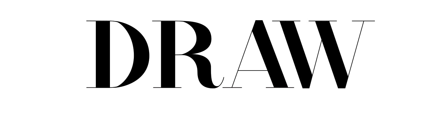
And voila! Now you have infinitely scaleable vector lettering! It might be a little difficult to get the hang of at first, but with practice, it becomes second nature. What do you have the hardest time with when using the pen tool?
